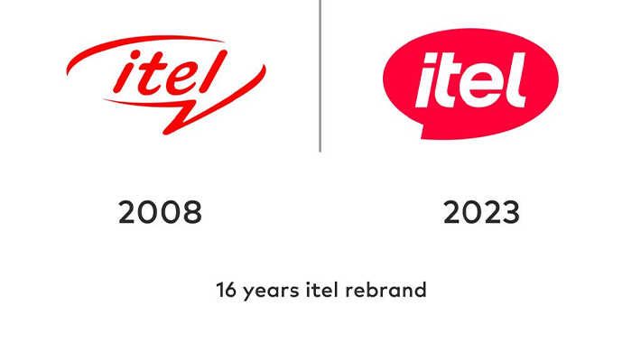
After 16 years, the updated logo reflects itel's dedication to reliability, innovation, and staying ahead in the market while maintaining core principles of affordability, quality, and accessibility.
The new emblem symbolizes a turning point, capturing the essence of itel’s brand promise, “Enjoy Better Life.”
Designed by the global team at DesignStudio in Australia, the revamped logo signifies a youthful, energetic, and forward-looking approach. The choice of magenta as the primary color reflects a commitment to youthfulness and positivity in navigating the dynamic tech landscape. The iconic speech bubble, retained in the logo, reinforces itel's role as a go-to brand for communication and connectivity.
The forward slanted angle in the logo emphasizes itel's focus on not only addressing current consumer needs but also shaping the future tech landscape with smart moves and innovations. From its roots as a smartphone brand 16 years ago, itel has evolved into a comprehensive "smart life" brand, offering a diverse ecosystem that includes smartphones, accessories, personal care products, and home appliances.
itel's commitment to affordability and innovation is evident in its diverse product range, making it a leader in both the feature phone and smartphone categories, as per IDC sales data in 2023Q2. The rebranding initiative is not merely cosmetic; it aligns with itel's philosophy of meeting evolving consumer needs and providing accessible and innovative smart technology for individuals and communities in emerging markets.
Underlining its mantra, 'Enjoy Better Life,' itel's rebranding signifies an ongoing commitment to innovation and evolution, ensuring ease, quality, and affordability for consumers in the ever-changing landscape of smart technology.


